The Art of Design
04 Oct 2022Has a bad website design ever deterred you from exploring further? Or has an especially good website design ever pulled you in? With millions of active sites available to users over the internet, UI design is one of the most important things to consider. A good or bad website design could be the difference between whether or not a business gains a new customer.
HTML and CSS are the core of UI design. As I worked with these languages, I was introduced to components such as headers, buttons, text boxes, and images. I also created a very simple website using the basics I learned. However, it can be very hard to make a website look good using only HTML and CSS. So as designs become more complex, it may be easier to start implementing UI frameworks. These provide users with APIs to build new UI components or customize existing ones without having to manually make all the changes with HTML or CSS.
Introducing Bootstrap
One UI framework that I’ve been working with recently is Bootstrap. This is a free and open-source CSS framework that contains HTML and CSS design templates. Compared to pure HTML and CSS, I found this much easier for implementing basic menus that look good. There were also a variety of classes that can be used for quick styling, such as changing to padding or centering text. However, I do think that Bootstrap would require a lot of time and effort to use effectively. At my current level of knowledge I don’t think I know enough about Bootstrap to fully make the most of the framework. Additionally, even if you try to only use Bootstrap when designing, there are still some things that would require CSS styling. One example I experienced was changing the background color to one not already defined in Bootstrap - there could be a way to achieve this, but I wasn’t able to find anything.
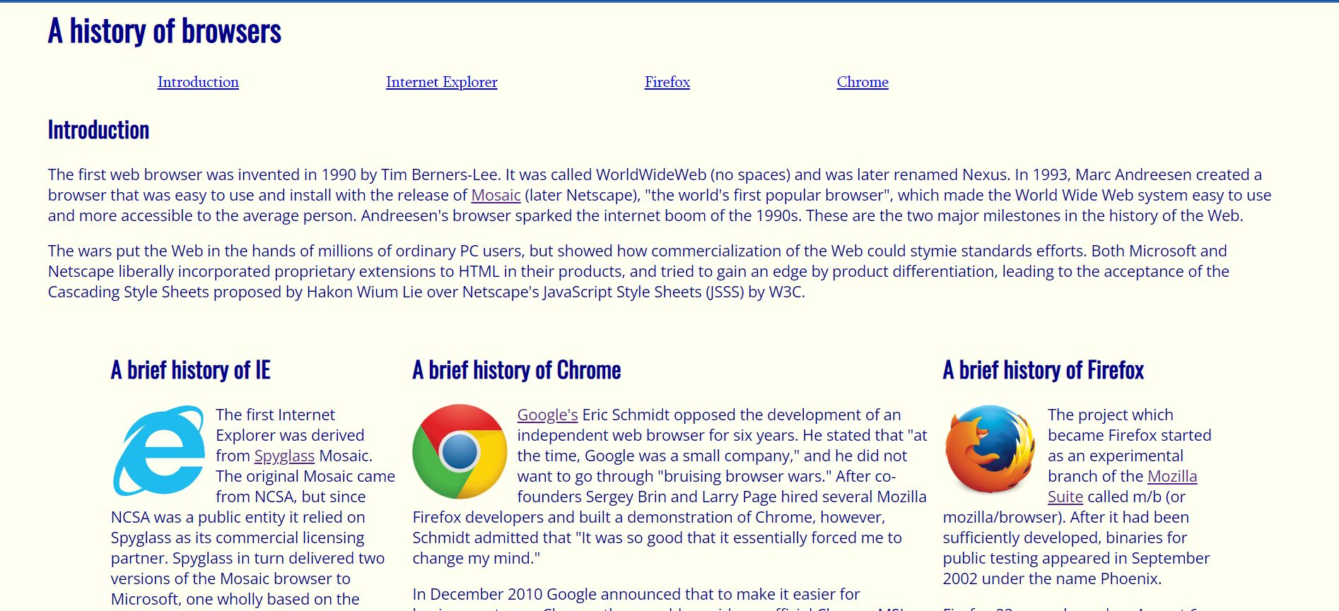
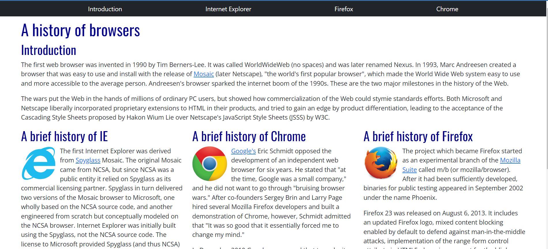
In the images below, we can compare a webpage created with pure HTML and CSS to the same page created again with Bootstrap.

Test site created without Bootstrap

Test site created with Bootstrap
One major change that can be seen is the navigation bar. Without Bootstrap, this was just styled as multiple links in a row. With Bootstrap, I was able to create a custom navigation bar that takes care of the styling for you. Of course, you could also make your own changes to the default style provided by Bootstrap.
Another change between the two sites that can’t as easily be seen is the column layout. Without Bootstrap, I had to create three separate classes for each column, and then adjust the “float” and “margin” properties to make sure that everything was lined up. With Bootstrap, all I had to use was the defined “row” and “col” classes to easily style the columns.
Learning More
Design isn’t really my strong suit, I often struggle with things like color choices and element layouts. So I definitely would have faced more difficulties if I had to design my own webpage from scratch. However, since I mainly practiced UI design by replicating existing websites, I feel like I was able to learn a lot more about styling with HTML, CSS, and Bootstrap. I didn’t have to worry about creating the website, only about how I would be able to best implement the UI frameworks. Overall, while UI design may not be for me, I learned a lot about the importance of UI frameworks and how difficult it is to create a website that is visually nice to look at. I also enjoyed seeing how my code created a final product that I could interact with.